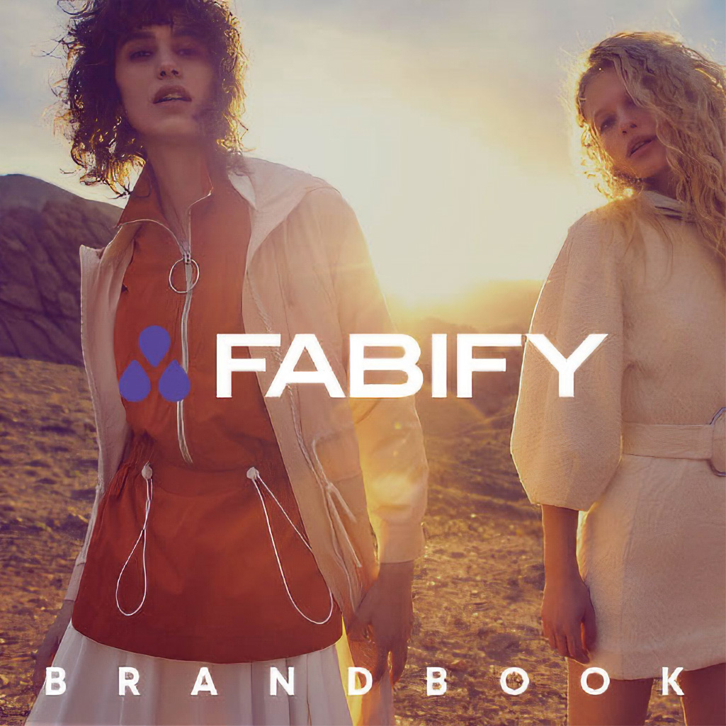
Fabify is a sustainability-focused retailer that resells end-of-line UK fashion in Eastern Europe, offering premium brands at accessible prices while saving surplus clothing from landfills. This brand book serves as the foundational guide for the company's visual and strategic identity.
Creative Direction and Design The brand book utilises a high-fashion aesthetic, combining cinematic photography with clean typography to align Fabify with premium UK labels.
The Problem Fabify needed to transition from a discount outlet image to a cohesive, professional brand that appeals to international suppliers and fashion-conscious shoppers.
The Solution & Execution I formalised a visual language featuring bold typography and a "quirky, fun" tone of voice. The guide establishes standards for logo usage and core values, ensuring consistency across all touchpoints while anchoring the design in Fabify's mission of sustainable, affordable fashion.
My role Creative direction, strategy, branding
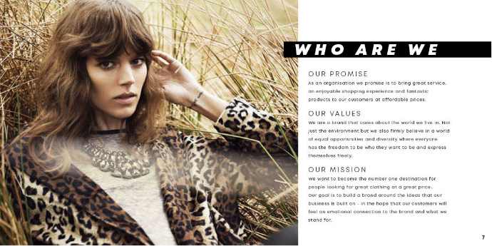 <
<"Who We Are": This section defines Fabify’s commitment to providing high-quality fashion at accessible prices while prioritising environmental sustainability. The layout highlights Fabify's mission to build deep emotional connections with customers by fostering a brand culture rooted in equality, diversity, and conscious consumption.
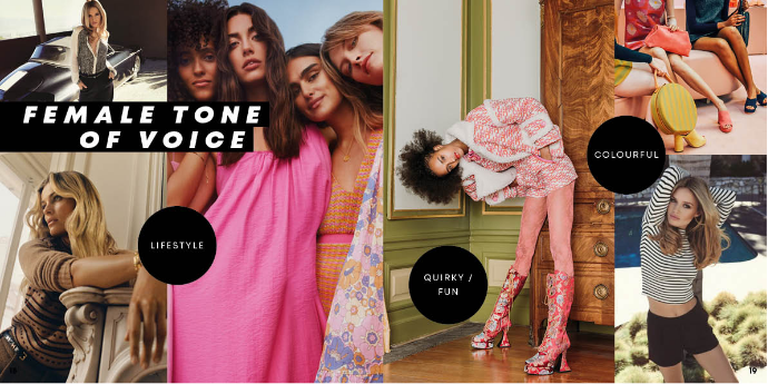
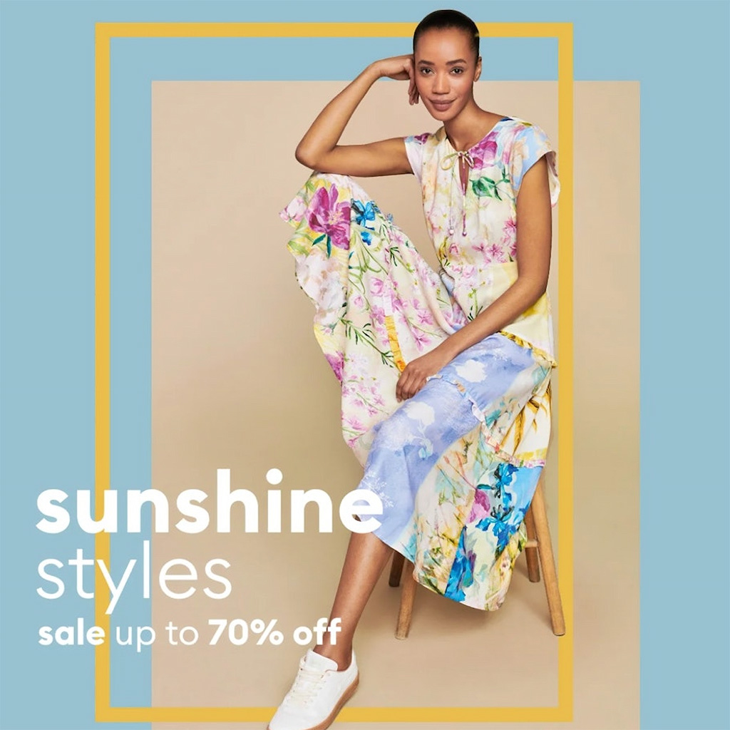
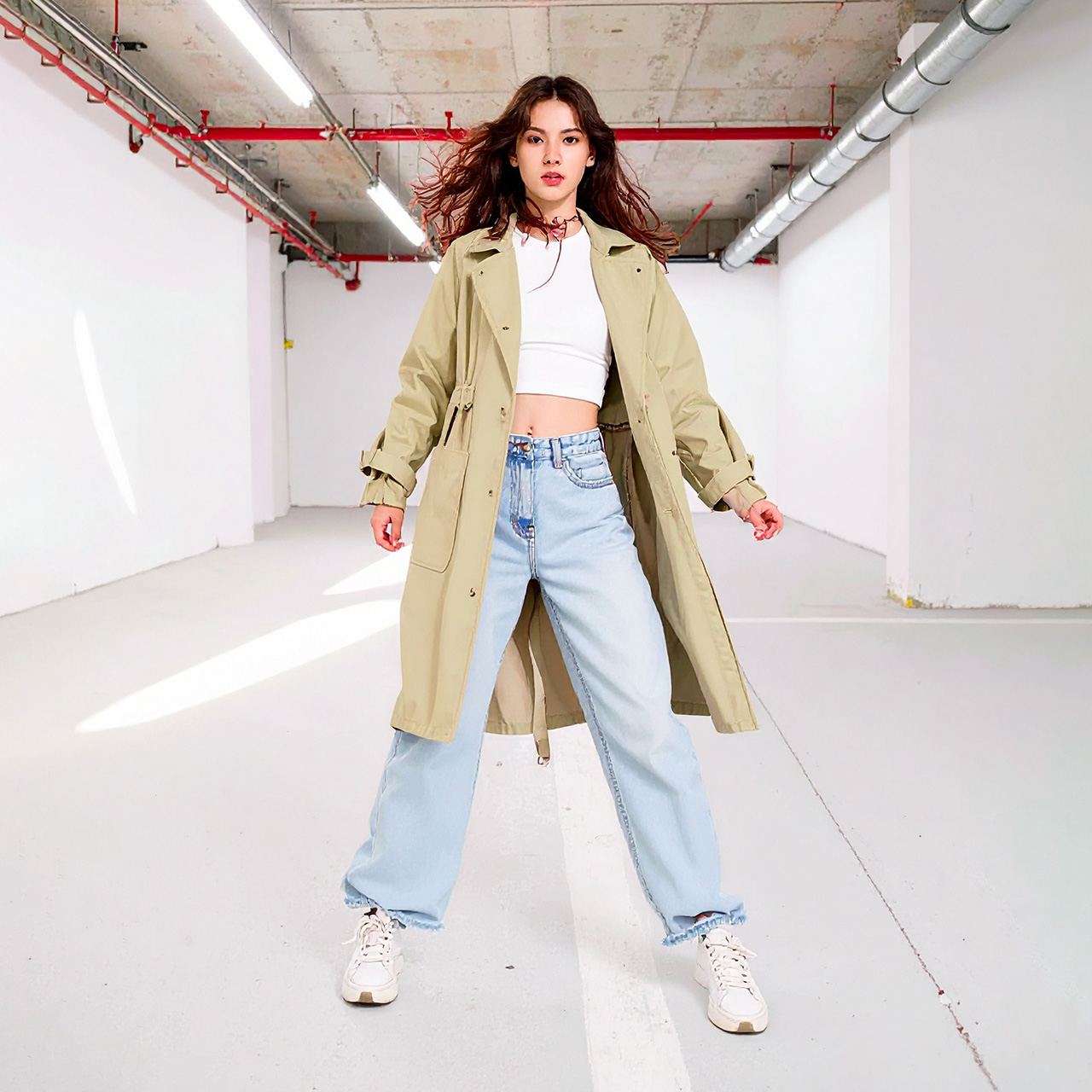
"Female Tone of Voice": This section of the brand book establishes a vibrant and relatable identity for Fabify, defining our communication style as quirky, fun, and colorful. The layout uses a lifestyle-driven photo montage to demonstrate how this personality should be reflected through aspirational imagery and high-energy fashion choices.
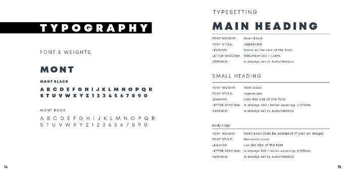 <
<"Typography": This guide formalizes the "MONT" typography system, detailing specific font weights, styles, and typesetting rules to ensure a consistent visual identity across all platforms. By defining precise standards for headings and body copy, the brand book creates a structured and professional look that supports Fabify’s premium aesthetic.
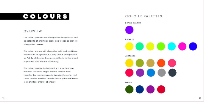
"Colours": This page defines a dynamic color strategy designed to stay current by adapting to changing seasons and trends. The palette features a bold, signature purple alongside a versatile range of brights, midtones, and darks, allowing the brand to maintain a recognizable identity while remaining sympathetic to the diverse UK brands it promotes.
 Last project